

SGP Simple Lite & Bold
AC+DC 007
☀️
Sunny / soleado 12c
Hi friends,
Something fun for the weekend.
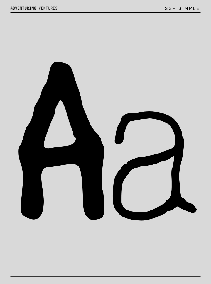
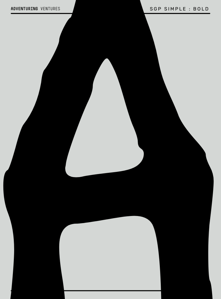
Introducing SGP Simple. My personal typeface!
It’s an ongoing project, I thought I’d share its current form with you today. I’m not a typographer, but I’m a fan. I really went down a rabbit hole back in 2017 and traced all the major typefaces - serif and sans serif - into a tiny sketchbook. I probably have that somewhere. I started visiting the Letterform Archive which happened to be 10min walk from my apartment in SF. What a treasure is that institution!
When I founded Adventuring Ventures in 2017, I had those studies and excitedly purchased a beautifully elegant typeface called Simple from Norm. I particularly like the A, J, M, O and W. Given the name of my company, a strong A was important. I had considered using Din, a typeface from early 1900s used for street signage. I wanted something prioritizing legibility and a heritage of facilitating our engagement with complex systems.
Sadly in 2023, Postscript fonts were discontinued by Adobe, MS, etc…somehow I didn’t notice it at the time. 🤷🏻♂️ Maybe because I was focused on web…anyway, I discovered the problem and Norm hasn’t provided an updated format yet. If they do, I’ll happily buy it again. So, in the meanwhile, I’ve created my own interpretation of it, by hand!
When I went to architecture school in the mid-90’s, it was common to learn how to letter - or write - by hand. All those drawings we made needed notes explaining details, dimensions, materials, etc. There was a whole method to it. My letters were fine, nothing exemplar. There is another post to be written about architecture’s odd choices of terrible all caps fonts. Point is, I have some muscle memory.
There is a free version of a typeface creator I’ve been using called Calligraphr. You download a template, write or place your letters into the template, scan, upload and build out the typeface which you can then download and use. It takes some iterations - which is why I will continue to tweak. Let me know if you want to try it out and we can set up a little online workshop to go through the steps.
I also just like the idea, in today’s AI frenzy, that I can insert this hand crafted mark.
I’ve imitated what I’ve seen before about how typefaces are presented. This is a bit tongue-in-cheek…but it was fun to put together to see how the letters and numbers work together. At the moment it is only lite and bold weights and missing some of the special characters…Here it is, enjoy!
Hola amigos,
Algo divertido para el fin de semana.
Presentamos SGP Simple. ¡Mi tipografía personal!
Es un proyecto en curso, y he pensado en compartir hoy con vosotros su estado actual. No soy tipógrafo, pero soy un gran admirador. En 2017 me sumergí de lleno en este mundo y tracé todos los tipos de letra principales, con y sin serif, en un pequeño cuaderno de bocetos. Probablemente lo tenga por ahí en algún sitio. Empecé a visitar el Letterform Archive, que casualmente se encuentra a 10 minutos a pie de mi apartamento en San Francisco. ¡Qué tesoro es esa institución!
Cuando fundé Adventuring Ventures en 2017, tenía esos estudios y compré con entusiasmo una tipografía muy elegante llamada Simple de Norm. Me gustan especialmente la A, la J, la M, la O y la W. Dado el nombre de mi empresa, era importante que la A fuera fuerte. Había pensado en utilizar Din, una tipografía de principios del siglo XX que se utilizaba para la señalización vial. Quería algo que priorizara la legibilidad y que facilitara nuestro compromiso con sistemas complejos.
Lamentablemente, en 2023, Adobe, MS y otras empresas dejaron de comercializar las fuentes Postscript... Por alguna razón, no me di cuenta en ese momento. 🤷🏻♂️ Quizás porque estaba centrado en la web... En cualquier caso, descubrí el problema y Norm aún no ha proporcionado un formato actualizado. Si lo hacen, lo volveré a comprar con mucho gusto. Así que, mientras tanto, ¡he creado mi propia interpretación a mano!
Cuando estudiaba arquitectura a mediados de los años 90, era habitual aprender a escribir a mano. Todos los dibujos que hacíamos necesitaban notas que explicaran los detalles, las dimensiones, los materiales, etc. Había todo un método para ello. Mis letras eran correctas, nada ejemplares. Hay otro artículo que escribir sobre las extrañas elecciones de la arquitectura en cuanto a las terribles fuentes en mayúsculas. La cuestión es que tengo cierta memoria muscular.
Hay una versión gratuita de un creador de tipografías que he estado utilizando llamada Calligraphr. Descargas una plantilla, escribes o colocas tus letras en la plantilla, escaneas, subes y creas la tipografía, que luego puedes descargar y utilizar. Se necesitan varias iteraciones, por lo que seguiré retocándola. Si quieres probarla, avísame y podemos organizar un pequeño taller online para repasar los pasos.
También me gusta la idea, en medio del frenesí actual por la inteligencia artificial, de poder insertar esta marca hecha a mano.
He imitado lo que he visto antes sobre cómo se presentan los tipos de letra. Es un poco irónico... pero fue divertido crearlo para ver cómo funcionan juntas las letras y los números. Por ahora solo tiene pesos ligeros y negritos, y le faltan algunos caracteres especiales... ¡Aquí lo tenéis, disfruta!
[sgp]


Thanks for reading.
If you appreciate this episode, please support my work by leaving a small tip using the “Invite me for a coffee” button. If you’re in Barcelona, let me know, and we can actually go for a coffee! ☕️🍷🍺
Si te ha gustado este episodio, te agradecería que apoyaras mi trabajo dejando una pequeña propina mediante el botón “Invítame a un café”. Si estás en Barcelona, avísame y tomamos un café. Gracias por leer.
Possibility Hours : FIELD REPORT
FIELD REPORT is the storytelling channel of Possibility Hours, a creative offering from my company Adventuring Ventures. It began as a podcast, and now a newsletter. FIELD REPORT’s goal is to reframe signals of external changes into opportunities for internal change. I want to harness the abundance of knowledge generated daily to bolster our readiness to change ourselves. FIELD REPORT es el canal narrativo de Possibility Hours, una propuesta creativa de mi empresa Adventuring Ventures. Comenzó como un podcast y ahora es un boletín informativo. El objetivo de FIELD REPORT es replantear las señales de cambios externos como oportunidades para el cambio interno. Quiero aprovechar la abundancia de conocimientos que se generan a diario para reforzar nuestra disposición al cambio.
Epic! This could go in a SuperContrivance HyperDrop!